Responsive Web Design
What Is Responsive Web Design?
 Responsive web design is an approach to web design to allow desktop websites and web pages to be viewed on any mobile device. With new devices with varying screen sizes being pushed out nearly every year, your website should be designed to be viewed on any device. More people are viewing their phones on trains, buses, etc. As such, it's easy for them to jump to a different website if yours is not mobile friendly. You may have just lost relevant traffic and prospective customers. Great responsive web design is not only having your website load and be functional on different devices. But it also has to look just as visually appealing.
What Should You Consider?
Responsive web design requires time and money. It's easy to make beginner mistakes and end up with a lot of frustration if you are not equipped with the knowledge. Older browsers can also be an issue. Switching to a newer browser can make the process easier. How is your web design performing? Is it doing what it's supposed to do? Can it be improved? Is it optimized? These are a couple questions to consider when doing responsive web design.
Does your content fit within the screen? Or, do your visitors have to scroll left and right to finish a sentence? By adjusting what seems like a tiny issue can get you more time on your website. People are easily turned off by having to continuously scroll for something that can be fixed. What's the difference between a website and a web app? It's likely that a web app has a different system than your website. Lastly, the overall design and development process should be neat, organized, and effective.
What Are The Best Practices?
 Responsive web design requires consistent content checks. Content does not only include written word. It also includes images, videos, and other 'content' you put on your website. On a desktop, go to your website and shrink and enlarge your browser. Is your content adjusting to the size? By doing daily check-ups on your content, you can ensure that your visitors are viewing the latest and greatest. Responsive web design also gives the user the option of hiding and viewing content to make the website more navigational.
Start small in your responsive web design efforts. While tablets are becoming increasingly popular for people to bring along, mobile phones are still the king. Before you consider all the devices that you can optimize for, start by targeting the most popular one.
Make it modular. Simplify the construction of your website to reduce frustration. And lastly, always keep optimizing. This can mean taking more of your time to make sure your website is running properly or the investment in a professional to design your website and monitor for you.
Touchscreens Vs. Cursors
Touchscreens are more popular on phones on tablets. However, brands such as Acer, HP, and of course Apple, are increasing popularity in touchscreens for desktops and laptops. Believe it or not, touchscreens come with different design guidelines than strictly cursor interaction. Fortunately, getting a responsive web design for both of these features is not a difficult feat. Touchscreens have no capability to display CSS hovers because there are no cursors. When a user touches the screen, they tap or click. So, you shouldn't be relying on CSS hovers for link definition. They should instead be considered as an additional feature.
Many design suggestions for touchscreens are thought of in the best interests of touchscreens. However, this does not mean that they impair cursor-based usability. An example would be the implementation of a sub-navigation on the right side. That would be more efficient for touchscreen users as most people are right-handed. Therefore, this would not hinder their navigation process when holding the device in their left hand. Having a sub-navigation on the right side would not be a nuisance to cursor users. So, why not go with a touchscreen design guideline?
Why Choose Digital Shift As Your Responsive Web Design Company?
Digital Shift is a transparent online advertising agency that serves small to medium-sized businesses. Nowadays, a great mobile website can be considered the lifeline of a business. Digital Shift not only offers professional website creation but also affordable web design services. Our professional website creation will get you a stronger online presence and drive relevant traffic.
We have affordable monthly website plans that have no upfront costs or contracts. And our monthly web design packages range from professional to enterprise. As a lot of our clients have entrusted us with their website creation and design, we've compiled a list of the most popular upgrades. Want to know exactly what the highlights of our web design services are? Our highlighted features are what makes clients more than satisfied with our services.
Digital Shift strives for long-term relationships with businesses. Your website will be continuously monitored and optimized by a professional. We also offer training for understanding the back end of your website to make sure you are just as aware as we are to what is going on. Contact us for a free consultation on how we can help you get a great mobile website to get more business!
Responsive Website Design is Our Standard!
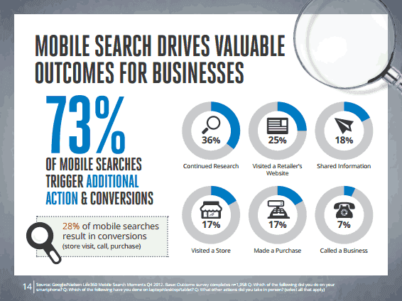
Most visitors are searching your website from a mobile device, which means your website must be mobile-friendly. A responsive website allows the user to have great usability, fast load times, and value-added functionality. It also means that the user will not leave your website because they are able to access the information they need without any glitches, slow load times, crashes, or other problems.

Mobile devices such as cellular phones, Smart Phones and PDAs are increasingly popular. The advances in technology makes mobile devices the new platform for website viewing. Quicker access to information makes a mobile responsive website most desirable and provides:
- Contact information: GPS/map integrations and one-click quick dial
- Marketing material: get access to current promotions on the go
- Web applications: Easy to use customized tools
Why Should I have a mobile responsive website design?
You want to be seen right? Google has a separate index for mobile responsive websites, which means your ranking will increase. Your visitors will spend more time on your mobile responsive website and be more likely to return. Having a mobile responsive website creates a better user experience. Imagine having to zoom in and scroll around a tiny little compressed website, this is frustrating for even the most advanced users. Your website is designed for a computer screen. A mobile responsive website optimizes your content to be displayed on a mobile device.
What Makes a Website Responsive ?
One way to determine if a website is mobile responsive is to observe how well it performs on a mobile device. If the resize and zooming is required the and if user is unable to navigate or is experiencing long load times, the website has not been optimized for a mobile device. The user is most likely to leave your website and continue his/her search elsewhere.
Are you Ready?
A mobile responsive website allows you and your company to tap into these opportunities. Simply directing people to your current web site or creating a smaller version of it is not the answer. Digital Shift will work with you to optimize the screen size and provide you with a professional design, clean layout and proper optimization for speed and device compatibility.
Responsive Design
Get high-ranking for mobile searches. With the massive increase in Smartphones and tablets, Google confirmed that it now uses the mobile-friendly factor when ranking your website. A highly mobile-optimized website will rank higher than a non-responsive version. Increase your SEO with Responsive Design. Edmonton is growing and becoming more competitive online, learn how a Local SEO Expert can help your business.
Why Get Started Today?
Keep in mind that nearly all your visitors will change to another easy to get at a website if you do not have a mobile-friendly responsive website. This may impact your site ranking. Website usability is very important. Don't lose prospective customers because of bad outdated design.

